
The Color Wheel & Amazing Senior Portraits
What do I wear for my Senior portraits?
“What do I wear?” This is one question we get asked more than any other, especially by our Seniors and families. Fortunately, you don’t have to worry! The solution lies in the color wheel. Picking out the perfect outfit for your senior portrait photography session is as easy as choosing to drizzle honey on your pizza at Beau Jo’s. Unless you don’t like honey, in which case the decision is still an easy no!
The answer? Color theory.
What is color theory?
Color theory is a lot like how it sounds: the primary theory of color and all its interactions! In other words, color theory is the collection of guidelines explaining how to best mix and use colors together to get the visual appeal you are going for. To create the most harmony, there are some basics to follow based on the color wheel.
What is the color wheel?
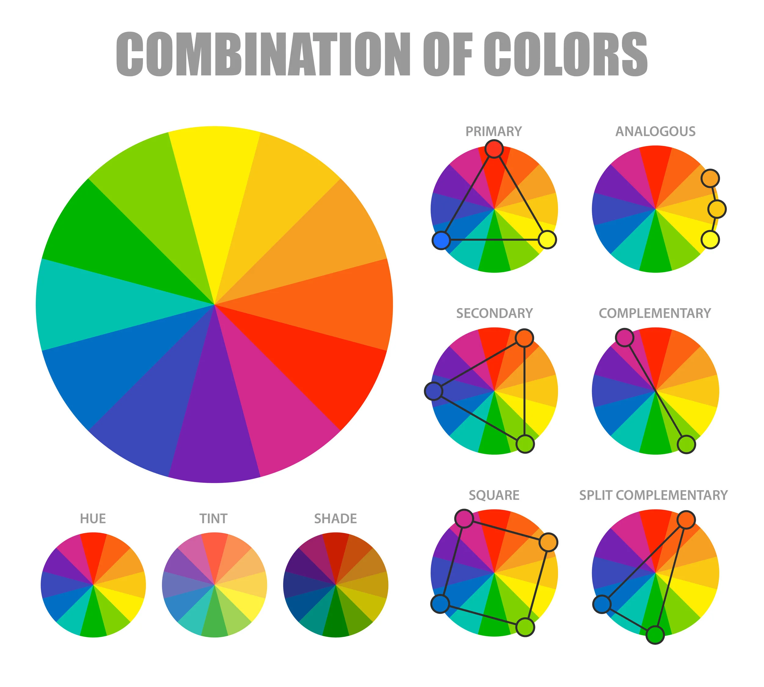
A color wheel is a simple way of visualizing relationships between the dominant colors. To begin with, there are primary colors, which consist of red, yellow, and blue. Traditionally, these are the colors that you can’t form by mixing any others. Secondary colors are green, orange, and purple. These exist by mixing the primary colors. Finally, there are tertiary colors. These are red-orange, yellow- orange, red-purple, blue-purple, yellow-green, and blue-green. Put all these colors next to each other inside a circle, and you have the color wheel! The hue, tint, and shades can change, but the fundamentals are the same.
When looking at the color wheel, there are a handful of main combinations that we find pleasing to the eye. Primary comprises the primary colors, and we make the secondary color combination out of secondary colors. However, there are also analogous, complementary, square, and split complementary color combinations, as shown in the image below.
How does this relate to Senior portraits?
In art and photography, those analogous, complementary, square, and split complementary color combinations are most universal. When these color combinations work together, we find them most aesthetically pleasing. The analogous combo uses three colors all right next to each other, creating a uniform look. Complementary color combination takes two colors, each directly across from each other on the color wheel, and places them together. A square combination of colors forms a square on the color wheel, and a split complementary combo looks like an isosceles triangle. That geometry class paid off, right?!
Use any of these combinations, and the results are sure to be stunning!
How do you use the color wheel before your photoshoot?
Now is the fun part! Using the color wheel, and those beautiful combinations we just mentioned, will make preparing for your photoshoot so much easier! Plus, using the color wheel in determining your outfits will make your resulting portraits stand out that much more.
Start by looking at the location you are shooting at. Is it lush and green? Maybe you could wear purple to boldly stand out using a complementary color combination. A light orange or blue could accent your outfit, following the square combo. Or maybe you want to tone it down a bit—that’s fine, too! Follow the analogous color combination with shades of blue, turquoise, and/or some yellows. You could even go the route of split complementary with just blue and red-orange. The possibilities are endless and entirely up to you!
If you haven’t decided on a location yet, but have the perfect outfit in mind, figure out what would complement that color best! Keep in mind when shooting in an urban setting, using the complementary color combination tends to work best to communicate that striking, confident vibe that a city holds.
Does this apply to family photography sessions?
Yes! Family photoshoots, engagement sessions, even picking out colors for your wedding! The color wheel is the ingredient that ties everything together.